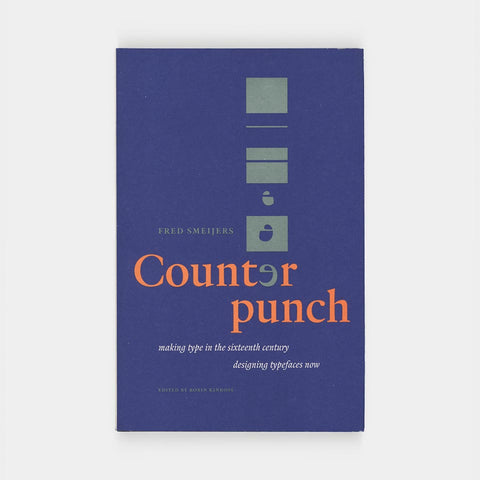
Counterpunch: Making Type in the 16th Century, Designing Typefaces Now
Typography is still dominated by letterforms from the first hundred years of European printing. What were the processes and attitudes that lie behind these forms? Fred Smeijers is a type designer who learnt to design and cut punches: the key instruments with which metal type is made. This book is a work of practical history, with much contemporary relevance.
Counterpunch is packed with ideas. It is both an investigation into the technics of making metal type by hand, and a consideration of present questions in type design. The discussion takes in the fundamentals of designing and making letters, so that the book can be read as a guide to type and font construction in any medium. Lively, pointed drawings and photographs complement an equally fresh text.
- Author: Fred Smeijers
- Size: 5.5 × 8.625 inches
- Pages: 200
- Binding: Softcover
- Condition: Very good and clearly never read. With an inscription on the half-title from a professor, thanking its previous owner for hosting a tour of her printing facility, and signed by all students present.
- Publisher: Hyphen, 1996


